This is my learning log for the OCA Ditigal Photographic Practice course

Saturday 14 September 2013

Part Three–Processing the Image


Project: The value of raw

Exercise: Raw
Before I started the exercise, I calibrated the monitor on my computer.
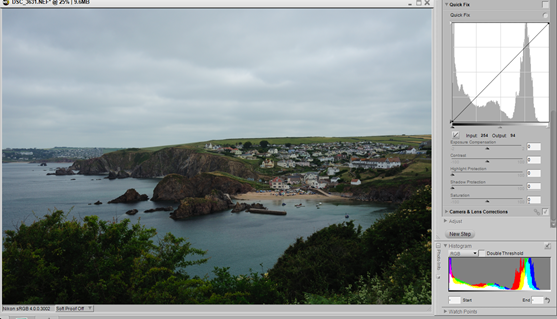
My first image was taken in daylight with the white balance set on direct sunlight - an oversight as the day had started that way. I thought it would be a good opportunity to see what RAW could offer in improving the image.

This is the RAW image before processing (Capture NX2):

image

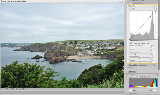
…and after processing:

image

This result was achieved by the following adjustments:
  • Pulled the right slider inwards to meet the edge of the histogram – lightening the image
  • Applied +0.35 EV exposure adjustment
  • Applied 29% on the Highlight protection slider to bring the white point in the sky to 248 from 255
  • Applied 49% on the Shadow protection slider to lift the shadows to a black point of 5

JPEG processing
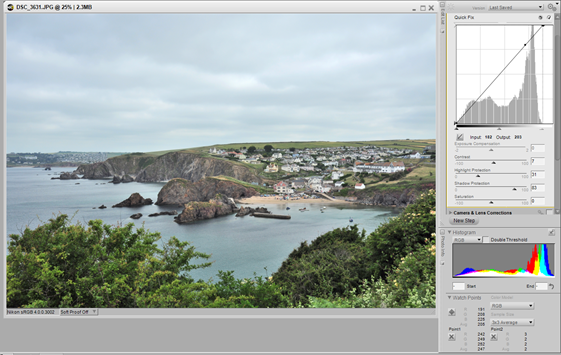
With the exception of the exposure compensation, the same tools were available to process the image:

image

To get a very similar result I applied these settings:

  • Pulled the right slider inwards on levels and curves
  • In place of the exposure compensation, I applied +7 to the contrast slider
  • Applied 31% to the highlight protection slider to reduce the highlight to 247
  • Applied 83% to the shadow protection slider to raise the black point to 2 only
Looking at the images in the browser, the JPEG seem to have lost some of its crispness. It was certainly fiddly to get a similar result without the exposure compensation option.

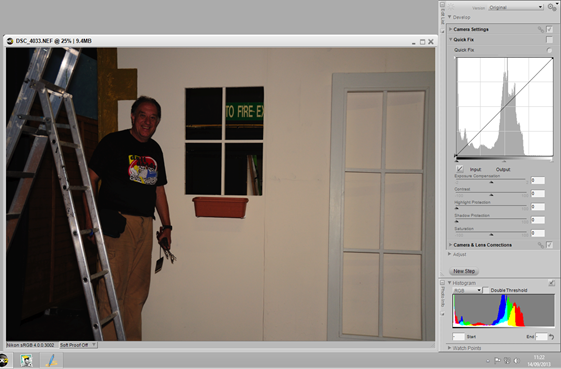
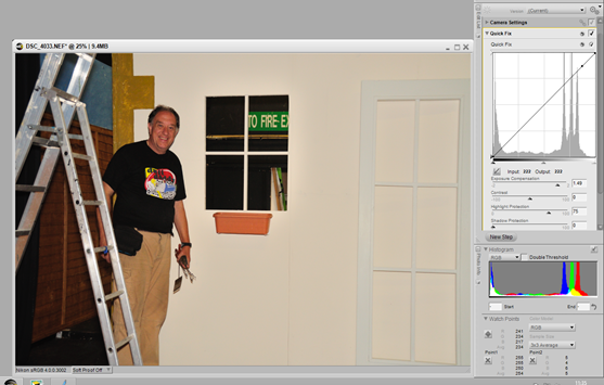
My second image was taken in artificial light (a mix of flash and fluorescent) White balance was set to auto because of the mixture of light types and the programme/flash setting exposed for the lighter coloured wall.  Here is the unprocessed RAW file:

image

……and the processed version.

image

This result was achieved by applying the following settings:
  • I reset the white balance to flash which gave a warmer light
  • Applied +1.5EV exposure compensation
  • Applied 75% on the highlight protection slider which brought the clipped highlight on the ladder to 254 on the watch point value.
  • I left the shadow protection at 0. the darkest point of the image at bottom left was 5 on the watch point value.


JPEG processing
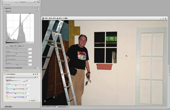
There were some colour issues with this version but I suspect the Auto white balance setting has caused this.

image

This result was achieved using the following settings:

  • I opened the colour balance slider and adjusted the the brightness to 100% to match the RAW version
  • Applied +8% on the contrast slider
  • Applied – 10% to the Red slider, +4% to the Green and –2 to the Blue to try match the tones of the RAW image.
  • Watch point values for the highlight and shadows were 250 and 7 respectively. These fell within the range as a result of the increase in brightness.


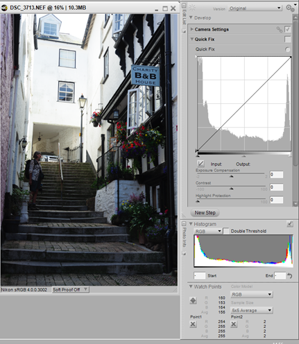
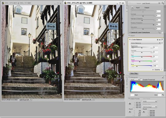
The third image for this exercise is a high dynamic range photograph (i.e) high contrast where the pixel value goes from 2 up to 255
This is the RAW image before processing:

image

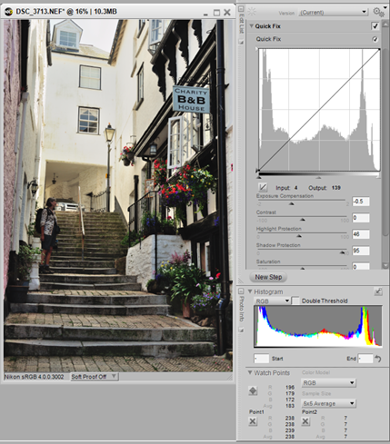
……..and the processed version:

image

I made the following changes to achieve this result:
  • I applied –0.5 EV to the exposure to bring the right side of  the histogram in a bit
  • Applied 46% to the highlight protection slider
  • Applied 95% to the shadow protection slide the lift the shadows
  • The white balance setting for the camera was direct sunlight. It was a bit blue so I changed it to Shade and then changed the fine colour temperature setting from 8000 to 6293°K


JPEG processing (the JPEG is on the right)

image

Although the white balance wasn’t a problem with this image, the lost highlights in the sky couldn’t be recovered in the JPEG. Again, matching the colour was a bit problematic. I used these settings:
  • Highlight protection slider 46%
  • Shadow protection slider  95%
  • Colour balance Green – 21%, Blue –48%
The pixel values for the image range from 7 to 255.

Conclusion
The principal differences between the pairs of images seems to be the colour, or a difficulty in matching the colour obtained in the RAW file after making adjustments for the white balance. The main difficulty with the JPEGs I chose for this exercise was colour but in the high contrast image the highlights were not recoverable. Processing RAW seems to be a faster and less complex technique than JPEGs.


Tuesday 10 September 2013

Current Conflicts Seminar–Study visit - 7 September 2013


Space 2 Gallery, Watford Museum
This visit was led by OCA tutor Les Monaghan. Prior to the visit, we ere given an essay to read in preparation for the visit. This was a short piece by Julian Stallabrass, The Power and Impotence of Images.
This essay followed on nicely from recent discussions in the Thames Valley study group. In summary, the essay discussed:
  • The assertion that democracy and the free market system leads to exploitation of the developing world and that war and torture are the inevitable consequences.
  • The depiction of the these conflicts and acts of torture has changed over time as the media corporations are now profit driven, pay less for news stories and the 24 hour news channels demand ever faster distribution of the images.
  • The relationship between military strategy, the conduct of war, media and technology.
  • The embedding of journalists within military units and how this gives a very narrow view of the conflict, easier to control.
  • References to Naomi Klein’s Shock Doctrine and Nick Davies Flat Earth News which paint a bleak future for mankind and photojournalism as a career.
  • The rise of TV news and the use of the images from ‘Citizen Journalists’ undermining the work of the photojournalist.
  • The comparison of  the media as it is now and what it was at the time of the Vietnam war and the danger that any opposition is drowned out and eroded by the constant barrage of news and images that bombard us 24/7.
Current Conflicts Exhibition
The gallery showed the work of six photographers and each (with one exception) gave a short presentation about their work and joined the discussion of the exhibits and the end of the visit.
Matthew Andrew – Constructs
Large format images. Interest in photographic truth, reality and unreality. Photos of fake objects. Developed into the depiction of fake war. Parallels between drones and war games – war gaming sites – simulations – not training but war games – enthusiasts realism. Became interested in the landscapes that these war games occupy. Engineered landscapes made for war games. Large print.
Olivia Hollamby – Home Front http://www.behance.net/gallery/Homefront/10693075
To photograph war you do not need to be in the battle zone. Honest representation of what war is about on a personal level. Absence  - Her collection showed photographs from her husband on the front line with personal found objects of her husband’s around the home. Poignant and very personal. In her talk she showed images from other photographers but unfortunately she was very quietly spoken and my voice recorder did not pick up her narration well enough for me to understand or remember what she had said.
Les Monaghan – on Richard Monje
A series of British bullets recovered from Afghanistan and photographed, in detail close up almost as abstracts. Quite beautiful to look at  but sinister too. Les raised the question of how far do you go in aestheticising images of war? (from the view point of the artist of course) He also mention Monje’s series of photographs of dummy IEDs that he made and photographed.
Les Monaghan – From the Forest
Work in progress. Our participation in looking and questioning will help it progress. Series shows a group of officer cadets on survival training isolated in the environment. Les questioned his own motives for making the series. As a journalist he was used to taking photos of people and telling their stories, communicating his ideas and maybe presenting and helping them with their problems. With this series he explained that he didn’t really care about the people in these photos, he wasn’t concerned about how arduous the experience was for them, he found he was more concerned about the aesthetics of the images.
Jamie SimonsIn Transit
Series of portraits of US soldiers taken at Atlanta Airport while grounded for 6 hours. Taken with compact camera. Jamie felt it perverse as he was going off  on honeymoon and these men and women were returning to war in Afghanistan. He found the subjects were showing individuality even within their collective identity by sitting alone and not communicating with each other. Suggested that they may be using the transit lounge, a sort of no mans land between the normality of their home lives and the reality of  the war situation they were returning to, taking the time to remember and reflect on their family lives. Jamie is a commercial portrait photographer and does not consider himself as an artist.
Christopher Down – Visions from Arcadia
Shot over 2 years as part of MA. Follows the seasons which are cyclical and unending like the vicious circle of war which humans find themselves in. Real servicemen preparing for, resting from and departing for a tour of Afghanistan. Set in the idealised landscapes of England (Arcadia) Not intended as heroic portrayal but rather Arcadia is an ideal that is fictional and doesn’t exist and cannot be realised.
In summing up, Les explained that this exhibition was intended as an alternative representation of war, a different way of looking at the destructive cycle of death and destruction. From Matthew’s landscapes of war game constructs, Olivia’s personal interpretation of what war means to those directly and indirectly involved, Richard’s aesthetic look at the objects of destruction, Chris’s view of the inevitability of war and the seemingly inescapable cycle, Jamie’s compulsion the record the likenesses of soldiers in transit as their paths crossed on their way to completely opposite extremes in the human experience and Les’s depiction of a possible alternative life he could have had if he’d followed his father into the RAF.
On a personal level I found this exhibition interesting. With two grandfathers as career soldiers, a father who spent time in the army up to the outbreak of WW2, when he was invalided out and 12 years as an MOD civilian working in the Army Education Service I found a lot of resonances. Living in a community with strong Army connections and towards the end of my time in the MOD, working with the injured service personnel at the Defence Medical Rehabilitation Centre and seeing the results of the destructive influences of war, both physically and mentally, I have found myself almost inured to war, resigned to mankind’s spiral into self destruction, hoping against hope that somehow, somewhere there is answer.


Tuesday 3 September 2013

Study Day –Thames Valley Group 17th August 2013


Another well attended and interesting study day in Thatcham.
Despite arriving late , we caught the tail end of the presentation of Eddy's project on the Gilbert Court residents portraits with audio commentaries, there was some discussion about the way his interviews were presented and how this enhanced the strength of the portraits. I thought it was an interesting concept and well presented.
John followed on from his last project using texts with photographs and showed us images of paper butterflies inscribed with messages of hope and remembrance from the Eden project. These he had paired with images, taken in the area on the same day. He was attempting to link the images with the words on the butterfly and also show a narrative by arranging 10 pairs in a sequence or two rows of five. Perhaps I missed something but there was only one pair that I could make a connection between and I failed to see the narrative in either arrangement. An interesting idea which needs developing further I think.
We congratulated Keith on his achievement in passing the Advanced Photography course at Level 3. He is continuing with MOP. He updated us on his Women Landscape Photographers project . As Catherine was present this time we learned more about his interaction with her as one of his subjects and he showed us the very high quality result of using a 5x4 view camera for Catherine's portrait. He then talked about the other project he is doing on the East End of London covering such diverse themes as emigration, gentrification, industrialisation, urban landscape, chronoscopes (landscapes with vestiges of times past), social reform, organised crime and education and how these have influenced life in the area. He asked the question (rhetorically, I think) how can I use photographs to convey these ideas of the diversity of the East End? Looking forward to seeing his progress on this.
Carol (new to the group) showed five monochrome abstracts that she had produced for TAoP Elements of Design. These were very strong and high contrast illustrating the ideas in the brief perfectly.
I showed the latest edit of my "Oosterschelde " creating narrative assignment for DFP It is far from finished but I needed to let go of it and get some impartial feedback. I have been 'living' with it for a couple of weeks and was getting very set in what I should include. Feed back on the whole was positive. John noticed that I seem to have run out of steam about half way through, the length of the clips had increased toward the end. I'll look into that . There are several things that I have done in response, taken the titles off the footage and displayed them on a black screen. I may just fade them in and out. It will be quicker. The whole thing needs tightening up, Keith said the subtitles weren't required, he understood Simon. Siegfried pointed out the titles and gaps between sequences and mentioned that Alice's interview footage seemed very close up. I explained the lack of tripod and how I had to rest my elbows on the table to keep the camera steady. Sharon liked the sea/sky sequences and the sense of actual movement from the camera which reflected the reality of the situation. There was also a feeling that perhaps there should be less talking and more action. I've made a few minor changes and posted it to Vimeo so that Robert can comment and answer my questions about the final cut length, music and title cards.
Siegfried presented 3 sets of 4 images to which she had applied varying levels of processing in PS. Her question was, how much processing was acceptable? The answer 'it depends' gave her no comfort. As I don't use Photoshop and only apply a limited amount of post processing to my images, to me the answer is 'as little as necessary'. If I find myself having to do more that just basic adjustments, I'll go and reshoot if possible.
Catherine is working on assignment 5 for People and Place. She has chosen a 1960's housing development as her place and a resident who has lived there since it was new. The estate blends into the landscape and looks as if it belongs there. She is completing the project for a fictional publication 'Architects Review'. An interesting project beautifully photographed.
Steve is continuing his work on TAoP, with a series of pictures of stained glass windows in local churches. He has taken a lot and is starting to edit the collection into groups of colour combinations for his next assignment. The colour and texture in the glass panels is very rich, an ideal subject.
Brian had recently photographed a family wedding. He showed some informal shots of the wedding party and was asking how he could improve the prints. He said he is not planning on making wedding photography part of his practice but just needed advice for this project.
Discussion Text
In, around and afterthoughts (on documentary photography)
I concluded that this must have been written in the late seventies or early eighties. I found the language very difficult and the ideas in this essay almost impossible to follow. References within it were varied, to photographers I had heard of but was not sufficiently familiar with their work. I ran out of time before the meeting so I couldn't do any research. Hopefully in the coming months, I can at least look up these photographers (Rijs, Hine, Evans et al) and find out why they are mentioned. Also, the copy of the essay I got from the internet had no clear pictures.
Rather than attempt to re-read the essay and again fail to follow its thread, I will use what I remember of the group discussion to put down my thoughts on what I think of as documentary photography and photographs as documents.
When I think 'documentary', films come to mind first. i.e. non fictional accounts of things that are happening or have happened in the past. So, a documentary film maker would be recording an actual event, e.g. how something is made, the community of those involved in its manufacture and /or the possible social benefits or problems associated with that process. A documentary photographer would do the same thing using still images and possibly team up with a writer (or add text themselves) This becomes photojournalism - is this something else, another genre? Does this make all documentary photographers photojournalists and all photojournalists documentary photographers? Perhaps photojournalism is just a job title.
Where and when does the photograph as a document become art? (and what is art anyway?) Rosler was writing about Migrant Mother the FSA photograph by Dorothea Lange taken in the 1930's. I suspect this photograph (despite the controversy surrounding Florence Thompson and Lange's apparent misunderstanding over the purpose of the photograph) has become famous because it is a good example of its type - reproduced in photographic textbooks. Whether the image became famous in its own right or because it was taken my Lange is a chicken and egg question.
The wider question of labelling genres will never go away. I've started reading Geoff Dyer's "The Ongoing Moment", The point is illustrated on page one showing the futility of trying to catalogue something so diverse with the example of a Chinese encyclopedia's attempt to classify the animal kingdom.
Following on from Saturday's discussion and staying with documentary
John sent us a link to an article by a female journalist working in Syria. I'm not sure I understand why anybody would put themselves through such privation and it the way of such danger. She certainly exposed the way journalism had changed in these times of rapid universal communication. She wants us to be able to say that we know what is going on in Syria. I'm not sue that I do. I never got to grips with the Balkans war. Afghanistan leaves me perplexed. All I see is the waste of life and resources. It's fine to have ideals and I admire those who do but fail to understand no matter how many reports they get through to us.
The second link that John sent posed these questions:
Can we understand war without looking at blood? And without seeing blood, would we know what war looks like?
Western media have largely chosen not to show extremely graphic images from conflict zones. If this trend continues and the stories we read are illustrated only by pictures of soldiers firing guns or tanks on the streets, are we eventually going to believe that wars are becoming less bloody and less violent?
Pasted from <http://www.trust.org/item/20130731160526-6x84g/?source=shtw>
The first question; war is a difficult thing to understand unless you have been involved in one. I haven't. My understanding of the concept of war comes from fiction, news reports and documentaries. Until the early seventies the majority of war images were black and white. The blood was there but it didn't jump out at you. We probably relied on the caption to reinforce our understanding and filled in the rest with our imagination.
The second question; yes. See my answer to the first question.
The third question; if you equate a bloodless real life battle shown on a media screen with other images (i.e. from computer games or movies) shown on the same screen then the danger becomes how do you tell reality from fantasy? This question was one posed last year at the Brighton Biennial by the video Five Thousand Feet is the Best by Omer Fast do the operators of remote strike drones, cocooned in their safe bunkers a continent away from the action, actually feel anything?
Pasted from <http://rjdown-dpp-log.blogspot.co.uk/search/label/Brighton%20Photo%20Biennial%202012>
I think we do become de-sensitised to blood and gore. Many years ago one on my favourite TV programmes was “Your Life in Their Hands” a pioneering attempt to show the work of surgeons by taking TV cameras into the operating theatre. It was ok as long as it was in black and white. As soon as the TV started showing operations in colour, I got queasy. For a while, anyway. Now it’s seems commonplace and easy to watch. That said, I’m sure the emotional interpretation to a war report counts for more than our visual interpretation.
This theme will continue this weekend with the study visit to “Current Conflicts”.